
The design world never sits still. Each year brings a fresh wave of aesthetic shifts, technological breakthroughs, and cultural currents that reshape how designers think, create, and communicate. In 2026, we’re seeing something particularly interesting: a tension between the hyper-digital and the deeply human. Designers are simultaneously pushing further into AI-assisted workflows and pulling back toward texture, imperfection, and emotional resonance. The result is a visual landscape that feels both futuristic and surprisingly warm.
Here’s a deep dive into the trends defining graphic design in 2026.
1. Anti-AI Aesthetics: The Handmade Rebellion
Ironically, the rise of AI-generated imagery has sparked one of the most exciting counter-movements in recent design history. As audiences grow increasingly savvy at spotting machine-made visuals, there’s a surging appetite for work that feels unmistakably human.
This trend manifests in rough-edged illustrations, deliberately imperfect typography, visible brushstrokes, and layouts that break conventional grids. Screen-printed textures, hand-lettering, and analog collage techniques are being digitally recreated — not to fool anyone, but to signal craft, authenticity, and intentionality. Brands in 2026 are using this aesthetic to communicate that real people made real choices about their visual identity.
For designers, this is both a challenge and a liberation. It’s an invitation to embrace the wobbly line, the smudged ink, the slightly off-center composition — and to let those “flaws” do the storytelling.
2. Dimensional Typography: Text That Lives in Space
Flat type is increasingly being left behind. In 2026, letterforms are becoming sculptural objects — inflated, extruded, bent, and dropped into three-dimensional environments. This isn’t just about slapping a drop shadow on a headline; it’s about treating typography as architecture.
We’re seeing type that appears to be carved from concrete, molded from clay, or inflated like vinyl balloons. Motion plays a huge role here: letters tumble, breathe, and react to cursor movements. Even in static applications like print and packaging, the illusion of depth is being achieved with sophisticated shading, perspective, and material textures.
This trend reflects our broader cultural obsession with immersive, tactile experiences — a way of making the digital feel physical when we’re spending more time than ever on screens.
3. Maximalist Color: Goodbye, Muted Palettes
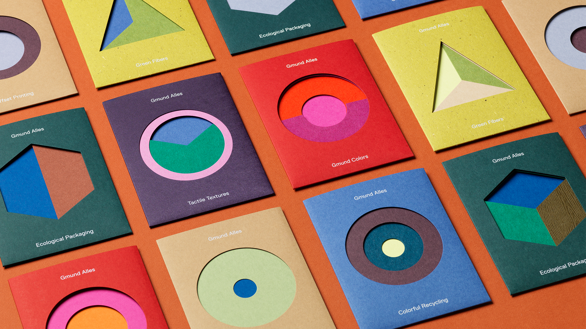
After years of safe, desaturated brand identities and the dominance of millennial pink-adjacent neutrals, 2026 is witnessing a full-throated return to bold, unapologetic color. Think electric tangerine paired with cobalt, chartreuse meeting burgundy, cyan colliding with rust.
This isn’t random vibrancy — it’s intentional chromatic tension. Designers are using unexpected color combinations to create visual energy and emotional immediacy. The influence here ranges from Y2K nostalgia to global cultural aesthetics that are finally getting their due, particularly from Latin American, West African, and Southeast Asian design traditions that have long embraced saturated palettes.
For brands, this shift signals confidence and vitality. In an attention economy, color is currency — and the biggest spenders are winning.
4. AI-Augmented Workflows with a Human Edit
While the anti-AI aesthetic is thriving in certain creative circles, a more nuanced relationship with artificial intelligence is becoming standard across the industry. In 2026, AI isn’t replacing designers — it’s becoming an indispensable part of the creative process, handled thoughtfully.
The shift is toward AI as a collaborator at specific stages: rapid concepting, generating reference imagery, exploring color and composition variations, and accelerating production tasks. What distinguishes leading designers this year is their ability to curate and redirect AI output with a strong editorial eye. The human judgment — knowing when something is good, when it’s wrong, when it’s almost right but needs a crucial tweak — remains irreplaceable.
Expect to see more studios being transparent about their AI use, treating it like any other tool in the kit. The stigma is dissolving; the skill is in the edit.
5. Retro-Futurism Revisited: The 1970s–1980s Revival
Nostalgia cycles in design tend to run about 40 years behind the present, and right on schedule, the aesthetics of the 1970s and early 1980s are having a major moment. We’re talking warm, earthy tones mixed with futuristic chrome accents; geometric sans-serif typefaces reminiscent of the space age; starburst motifs and halftone patterns; and the particular brand of optimism that characterized design before the digital era took over.
What makes this revival feel fresh rather than merely derivative is how contemporary designers are mashing these retro cues with current technology. Think 1978 poster aesthetics rendered in real-time 3D environments, or early-computer-era pixel grids treated with modern motion. The result is a kind of warm nostalgia filtered through a knowing, contemporary lens.
6. Inclusive Design as a Visual Language
Inclusivity in design has evolved from a checklist into a genuine aesthetic philosophy. In 2026, more designers are actively expanding what “default” looks like — in the bodies, skin tones, abilities, and cultural backgrounds represented in their work, and in the accessibility baked into their design decisions from the start.
High-contrast color usage, thoughtful typography choices that support readability, and illustration styles that represent diverse human experiences aren’t just ethical imperatives — they’ve become markers of sophisticated, contemporary design. Audiences increasingly gravitate toward brands that visually signal “everyone is welcome here.”
This trend also extends to neurodiversity-informed design: layouts with cleaner information hierarchies, reduced visual clutter, and clear wayfinding that serves a wider range of cognitive styles without sacrificing visual interest.
7. Sustainable Design Aesthetics
As climate consciousness deepens, it’s shaping not just what brands do, but how they look. The visual language of sustainability in 2026 has moved well beyond green color schemes and leaf iconography. Designers are developing more nuanced aesthetic systems that communicate environmental values through material-inspired textures, earthy palettes, stripped-back layouts that suggest reduced consumption, and honest, unadorned typography.
Packaging design is at the forefront of this shift — with visible recycled materials, ink-saving designs, and a deliberate avoidance of excess decoration becoming design choices in their own right. There’s a beauty in restraint that more designers and clients are leaning into.
8. Motion-First Design
With social media feeds, digital signage, and interactive platforms dominating how most people encounter design, motion has become a primary consideration rather than an afterthought. In 2026, many designers are approaching projects with animation in mind from the very first sketch.
This means designing systems with movement built in: logos that have a defined motion behavior, type that has choreographed entrance and exit states, brand colors that shift and breathe. Micro-animations — the subtle bounce of a button, the smooth transition between screens — are increasingly treated with the same care as the underlying static design.
The challenge for designers is learning enough about motion principles and tools to communicate effectively with developers, or developing those skills themselves. The blurring between graphic design and motion design continues in 2026.
Putting It All Together
What’s striking about 2026’s design landscape is how many of these trends exist in productive tension with each other. The handmade rebellion and the AI-augmented workflow. The retro warmth and the dimensional futurism. The maximalist color explosion and the restrained sustainability aesthetic. Great designers this year aren’t picking one lane — they’re navigating between these poles with intention, choosing the approach that best serves each specific communication challenge.
That’s ultimately what good design has always been: not trend-chasing, but using the full vocabulary available to you to say something that matters, to the right people, at the right moment. The trends of 2026 just happen to make that vocabulary richer and stranger and more exciting than ever.
